Creation is inspired by reality. We chose the topic of sexual abuse of minors because it is a heartbreaking, highly sensitive, and complex social issue that, unfortunately, has not gained widespread attention. Notable cases, such as the 2019 molestation of a young girl by NPC deputy Wang Zhenhua, the 2020 sexual abuse of an adopted daughter by Bao Yuming, and South Korea’s Nth Room scandal, have made this issue more profoundly real for our team. These incidents have underscored the severe impact of child sexual abuse, revealing how the safe and sunny world that should belong to children is, in some ways, vanishing—transformed into something more like Fang Siqi’s tragic world.
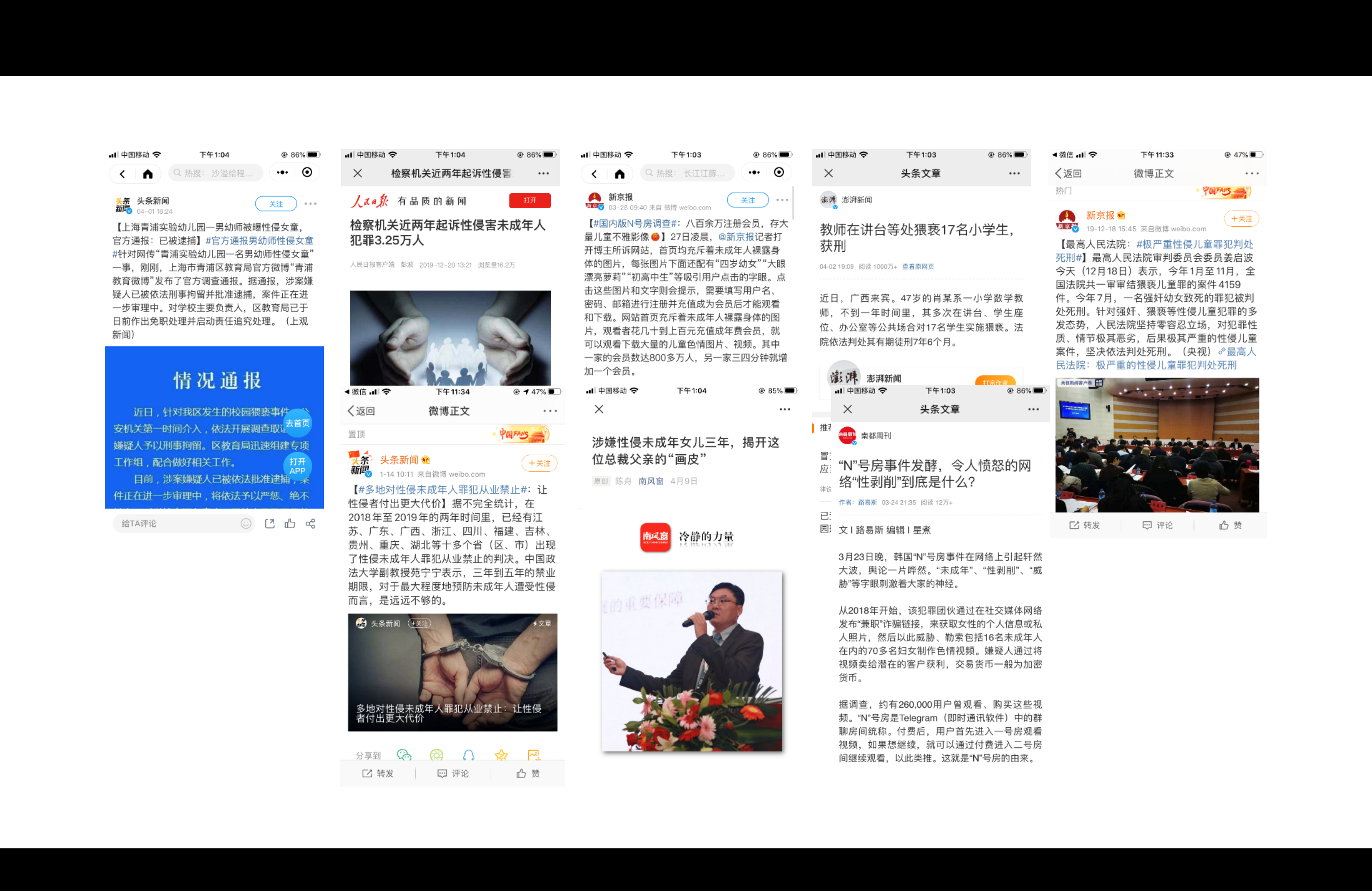
News of sexual abuse of children
What’s particularly alarming is that many remain unaware of the gravity of this problem. Art and literature on the topic are scarce, with even fewer works using the medium of informational graphic design. It is with this gap in mind that we hope to make a small but meaningful contribution, reclaiming and redefining the pure and innocent world that belongs to children.
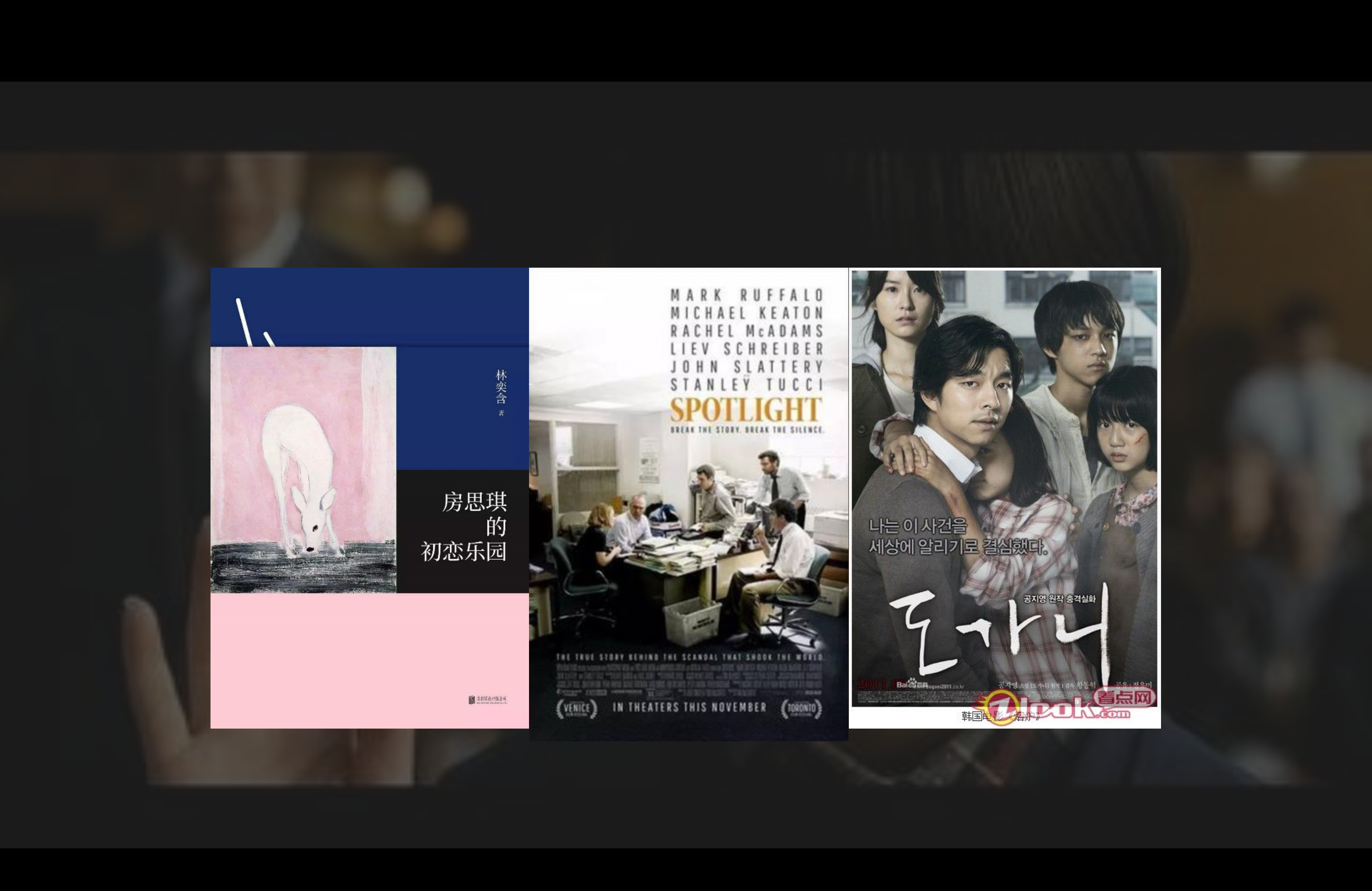
Literary or film works on related topics
The first one is our design philosophy. We hope that through “Reclaiming Paradise: Focus on Sexual Abuse of Minors”, we can call more people to pay attention to sexual abuse of minors, so that they can join the team of sexual protection of minors and work together to promote the improvement of laws at the macro level; and we also hope that parents can get some inspiration and guidance from it, so that they can pay more attention to sex education of their children, especially sex abuse prevention education.
Design Philosophy
Our data and information mainly come from domestic and foreign authoritative paper websites, relevant legal provisions, various visualization competitions and books, then in order to work not so obscure, we also searched on the search engine, both professionalism and popularity; and then extract the main points of information and hierarchical differentiation, and create a mind map; then draw a draft of the graphic representation of each small point of information, and agree on a composition. Our work is purely original, from the presentation of the whole work to the discretion of a color value, a small icon or a word. The first, third and fourth images of the work are made within this framework.
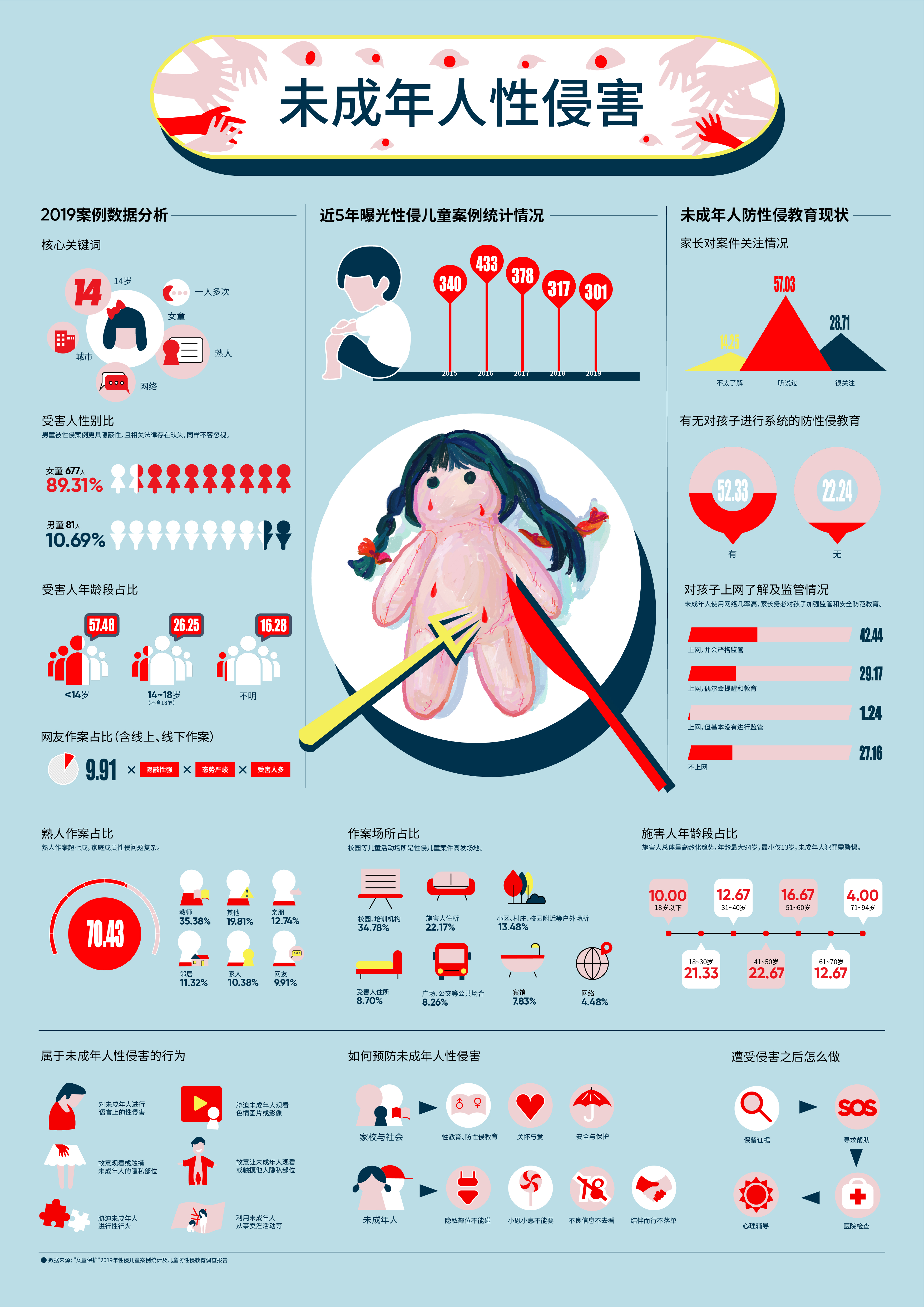
Status of sexual abuse of minors
For the second image, which is relatively less informative, we chose a more varied composition. The composition was inspired by Mondrian’s work and gradually took shape through a step-by-step process of modification and generalization.
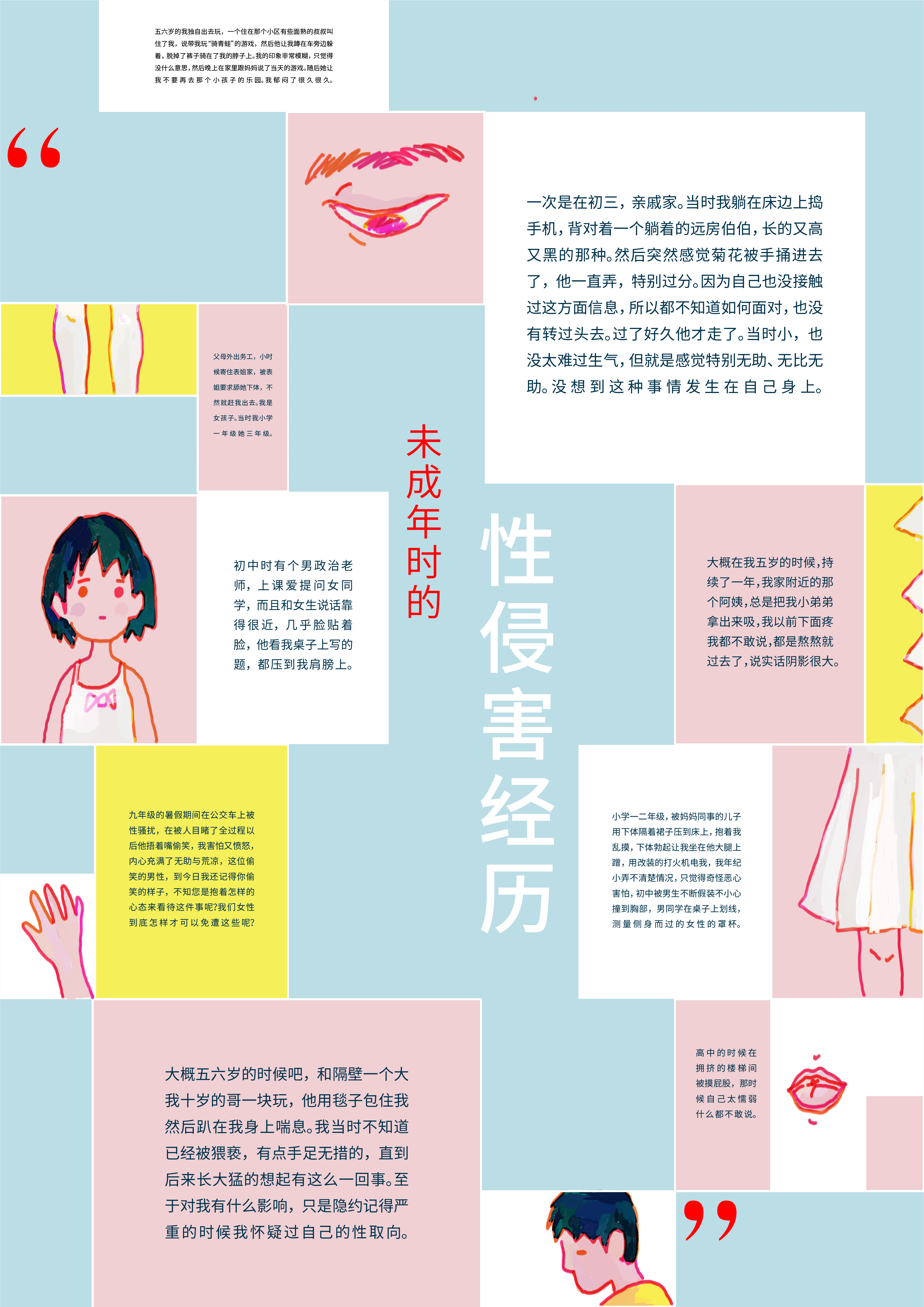
Experiencing sexual abuse as a minor
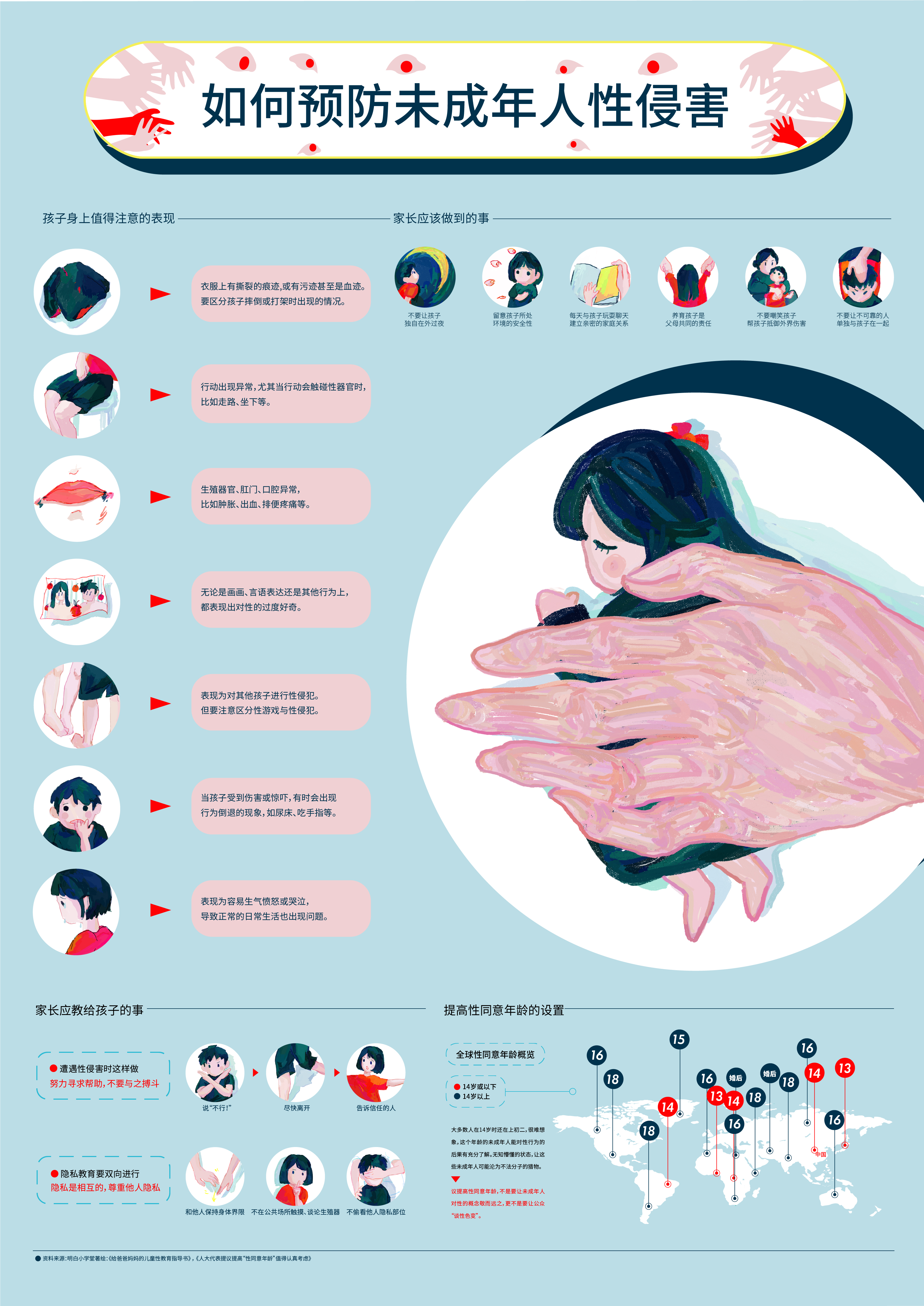
How to prevent sexual abuse of minors?
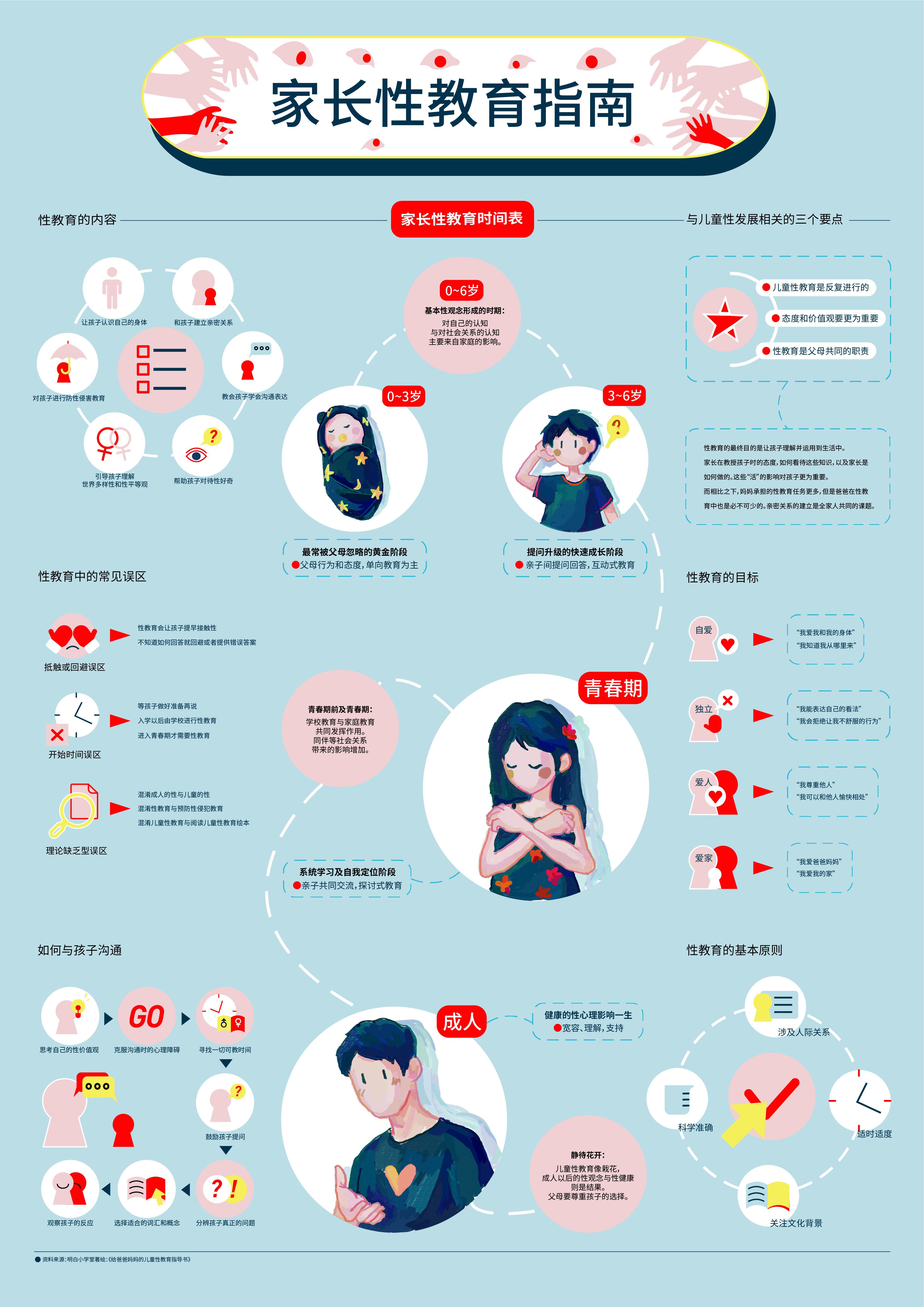
Parents' Guide to Sex Education
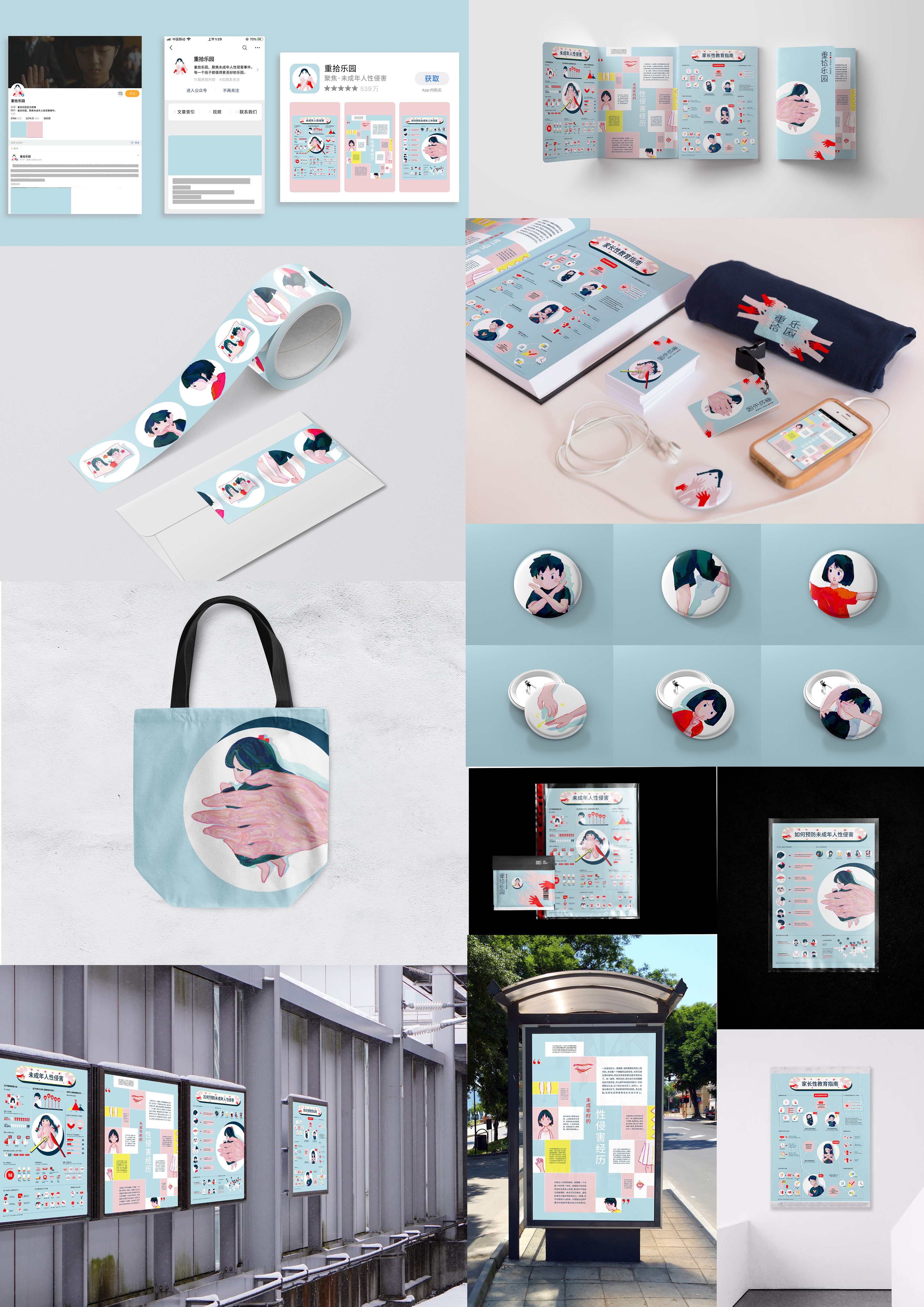
Expanded Application of Works
In order to express the connotation, harmony and beauty of the work, the color scheme of the work is mainly based on the five colors of blue, pink, yellow and red, and we have given a special meaning and expectation to these colors: we hope that in paradise, blue is no longer tears but the sky; pink is no longer bare skin but the redness on children’s smiling faces; yellow is no longer pornography but sunshine; red is no longer blood but justice. The color yellow is no longer pornography but sunshine, and red is no longer blood but righteousness.
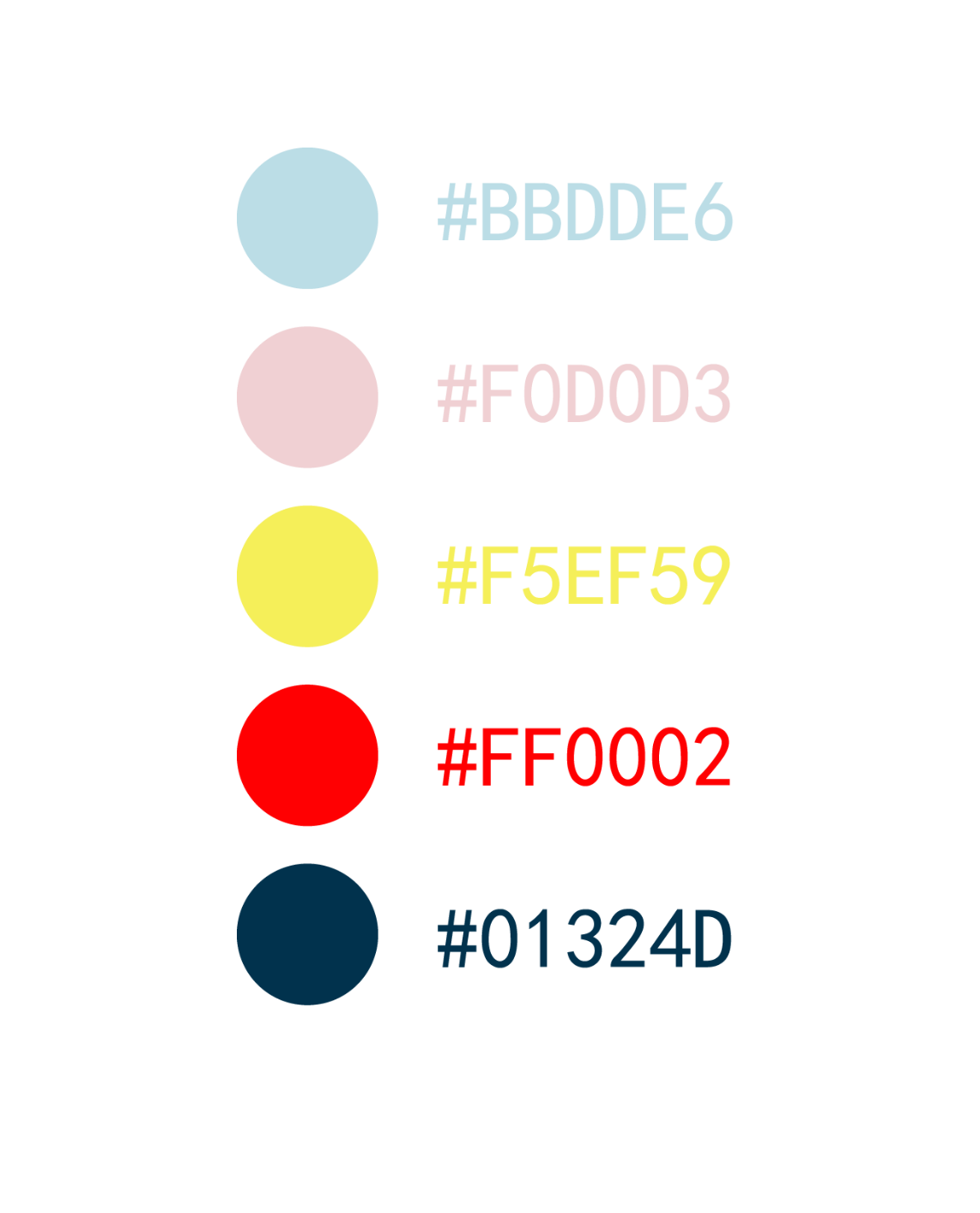
Theme Color of the Work
Next is the LOGO section. The design of the Logo evolved from the center image of Figure 1. The crying doll lying on the plate, under the knife and fork is our interpretation of the image of “sexual abuse of minors”, the element of the doll refers to the injured children, but also associated with the paradise, the knife and fork refers to the perpetrator.
The knife and fork refer to the perpetrator. We then simplified and flattened the image, replacing the knife and fork with the element of a hand to create our logo, which is about protecting and reclaiming paradise.
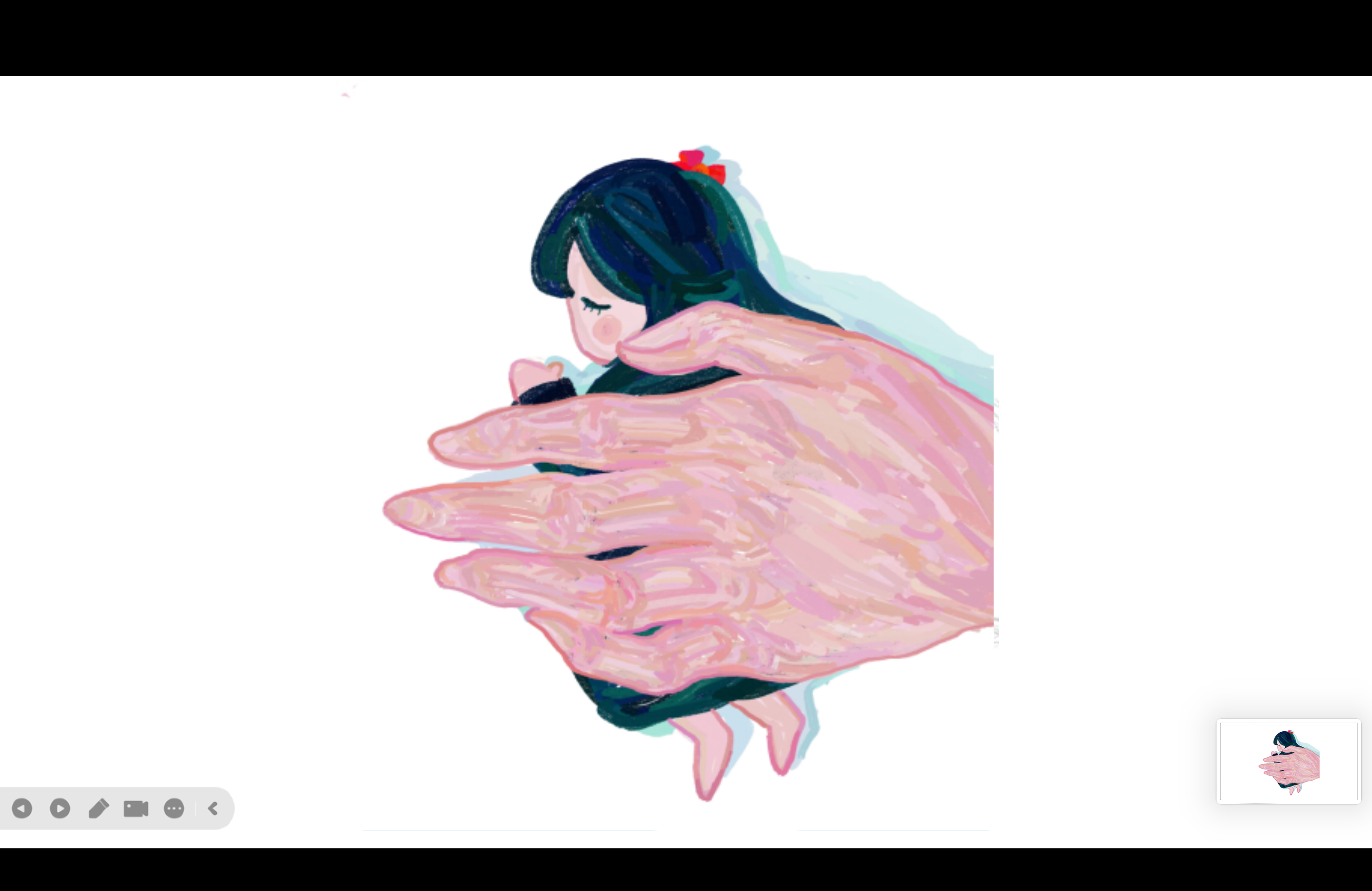
Logo of the work
And the work uses many hand-drawn illustrations, mainly through the flat drawing, with ps, ai, sai and other auxiliary tools. We hope that through these illustrations, the public will be able to accept the information more succinctly and learn it actively.
#creationsLast modified on 2020-05-20